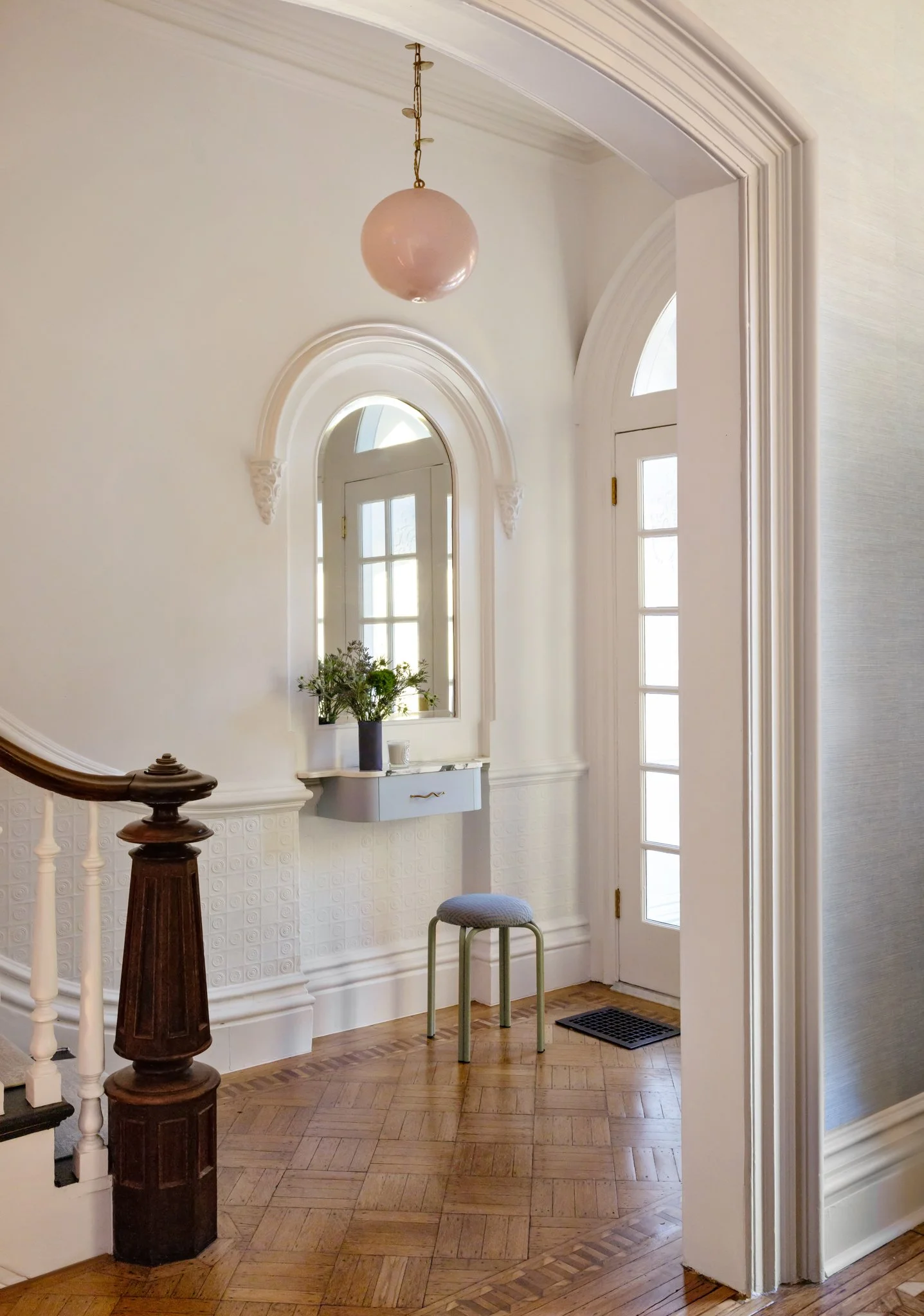
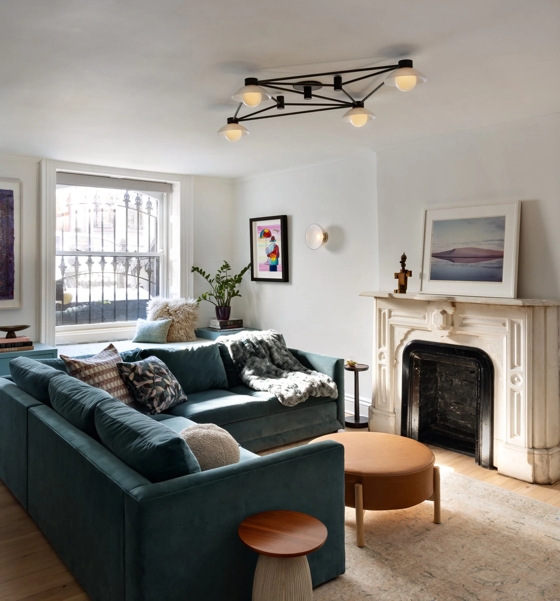
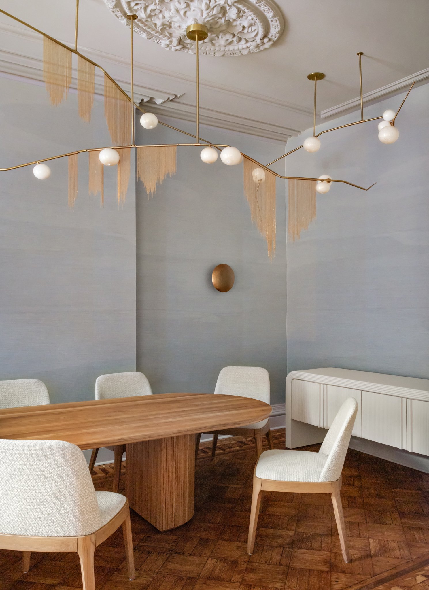
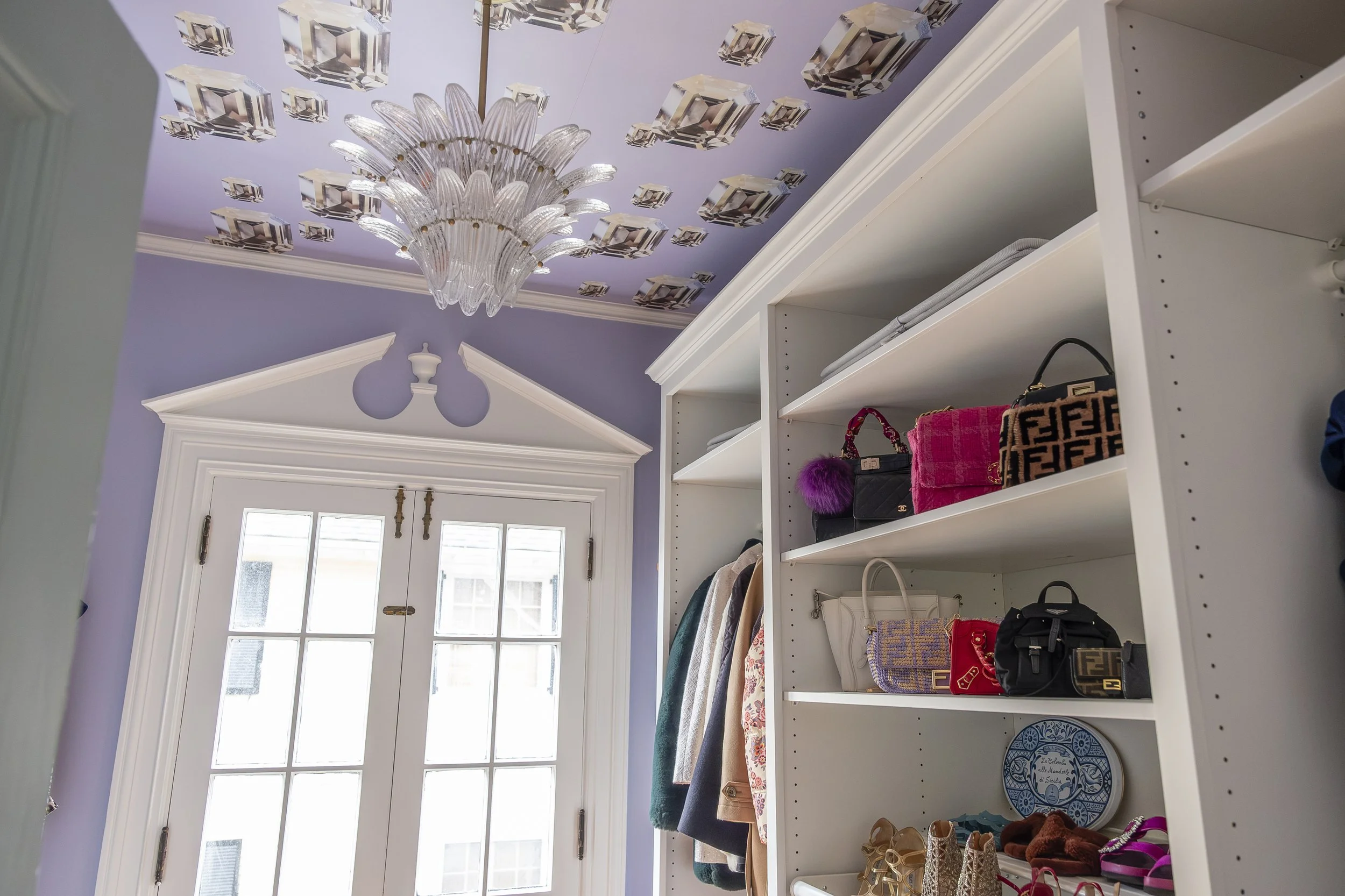
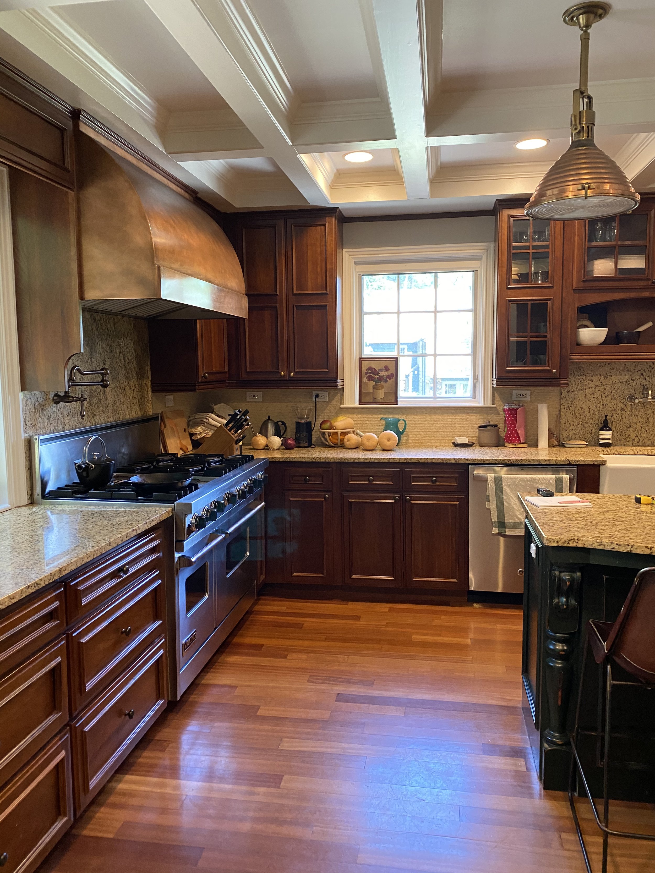
This grand Tudor home was built in 1924 and was purchased by our clients in 2016. The owners loved the charm of the woodwork and mouldings inside and some of the beautiful original design features in the living areas, but the kitchen was dark and dated.
In 2020 I started the process of designing a new kitchen and it’s adjacent breakfast room and mud room. We were met with the typical challenges of that year, supply delays and shutdowns due to covid exposures but the end result was worth all of the added effort!
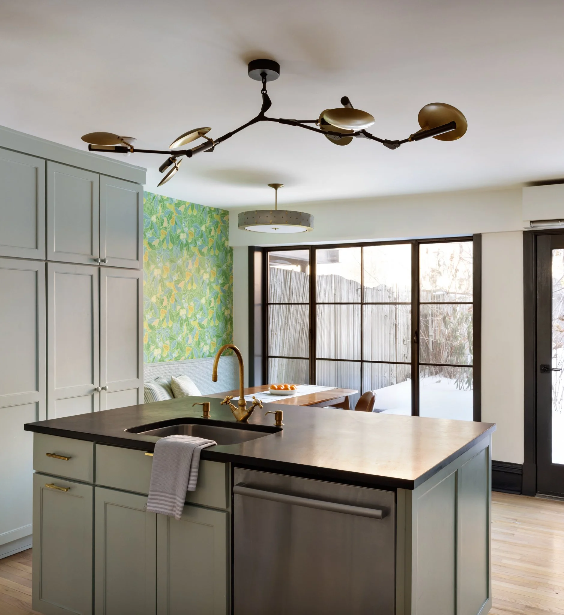
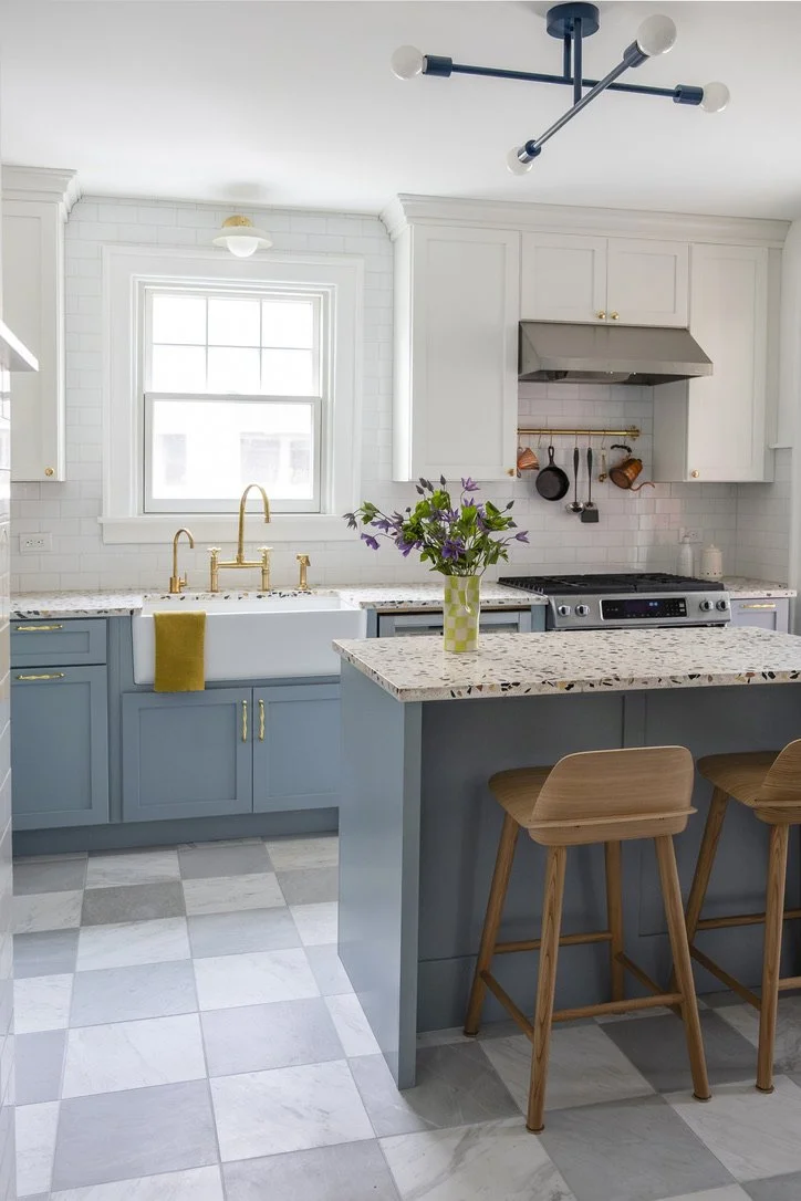
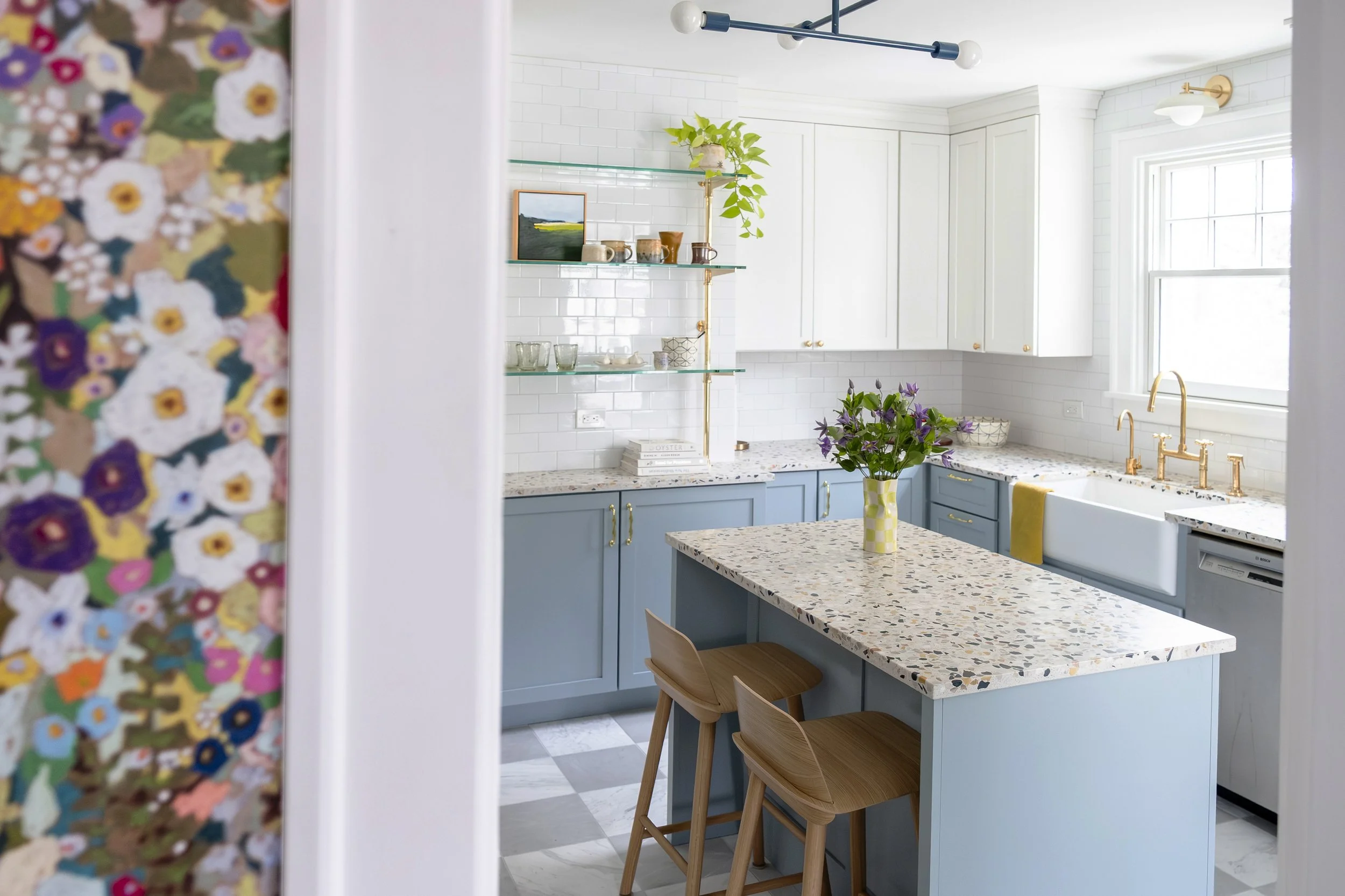
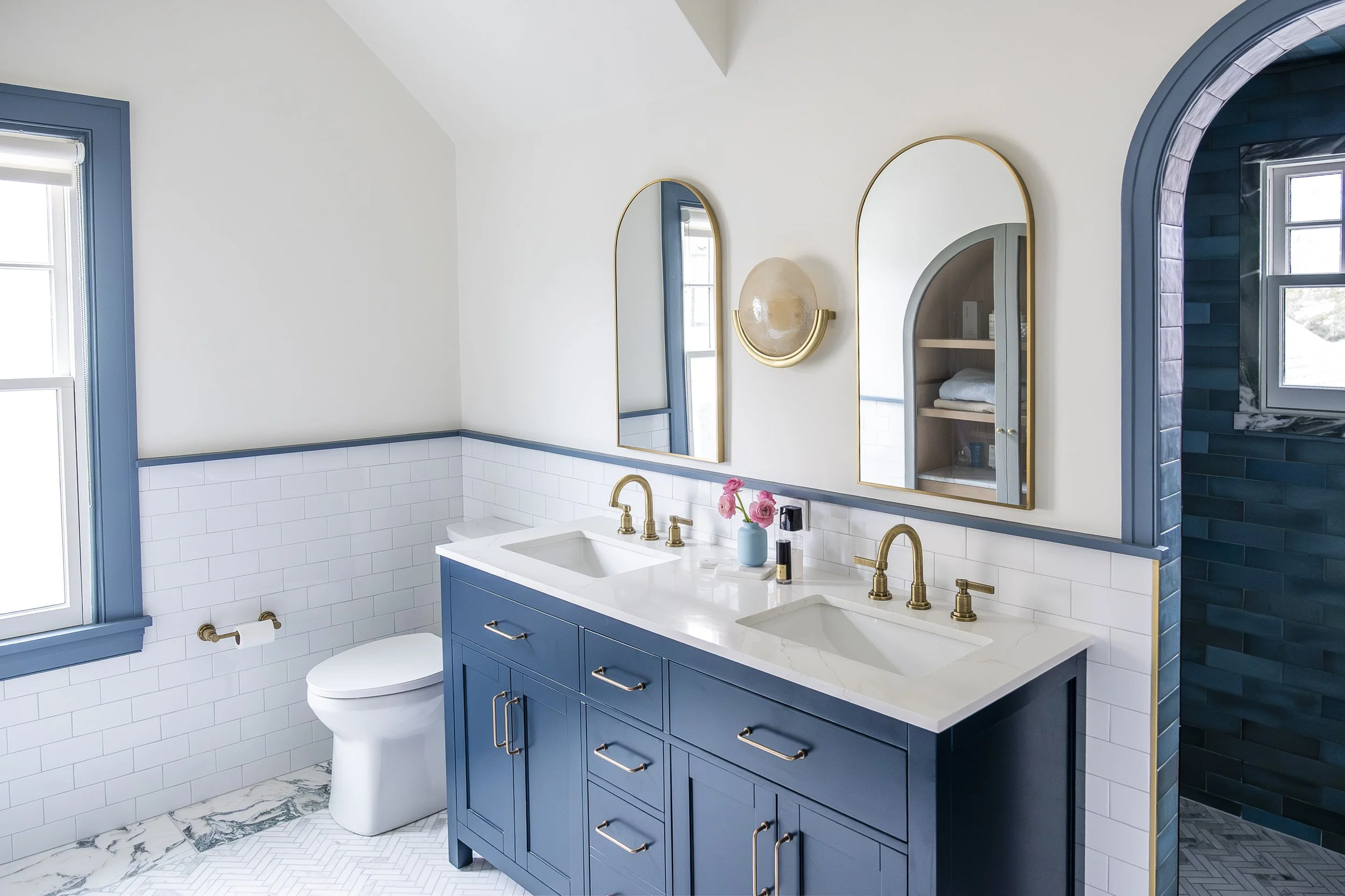
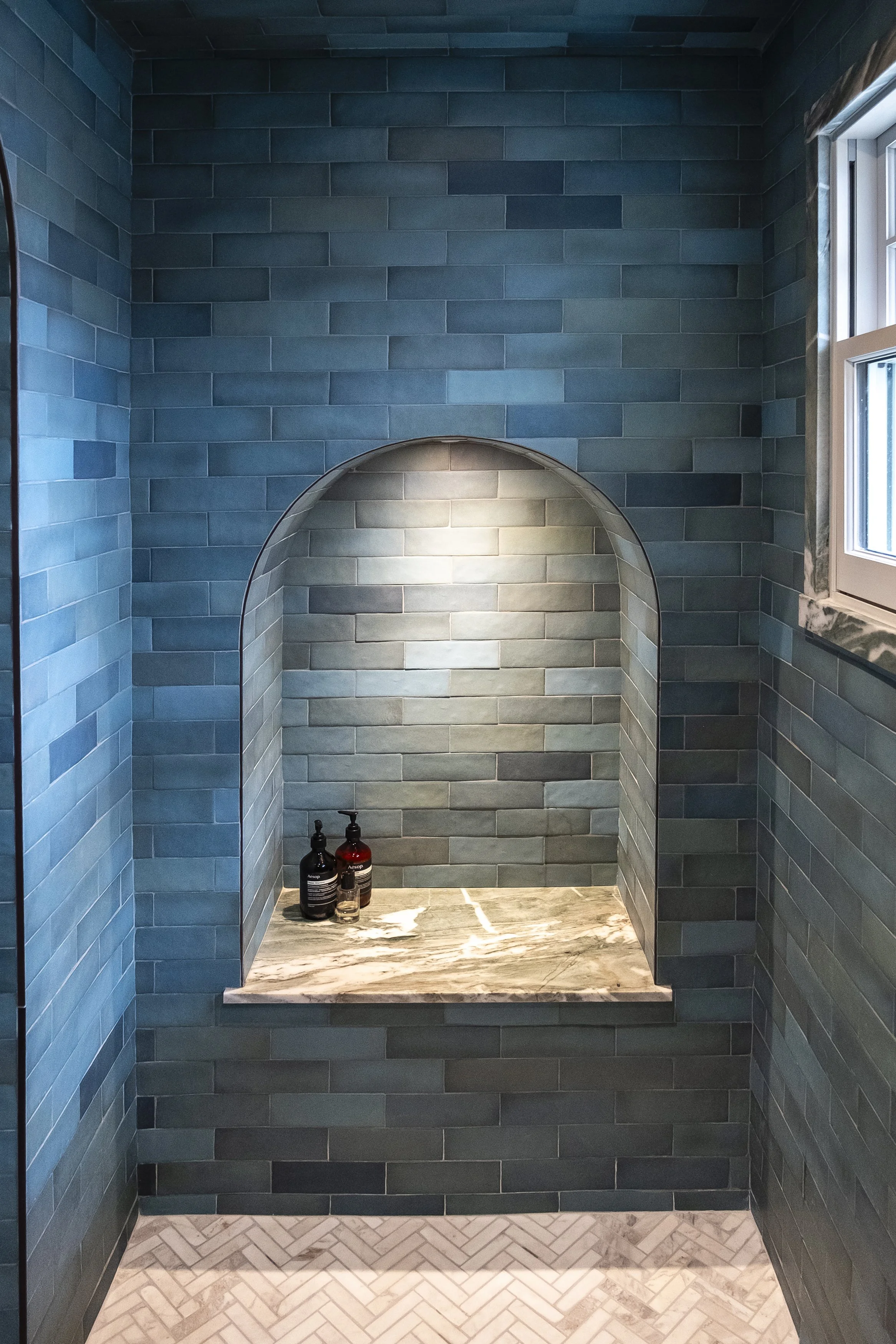
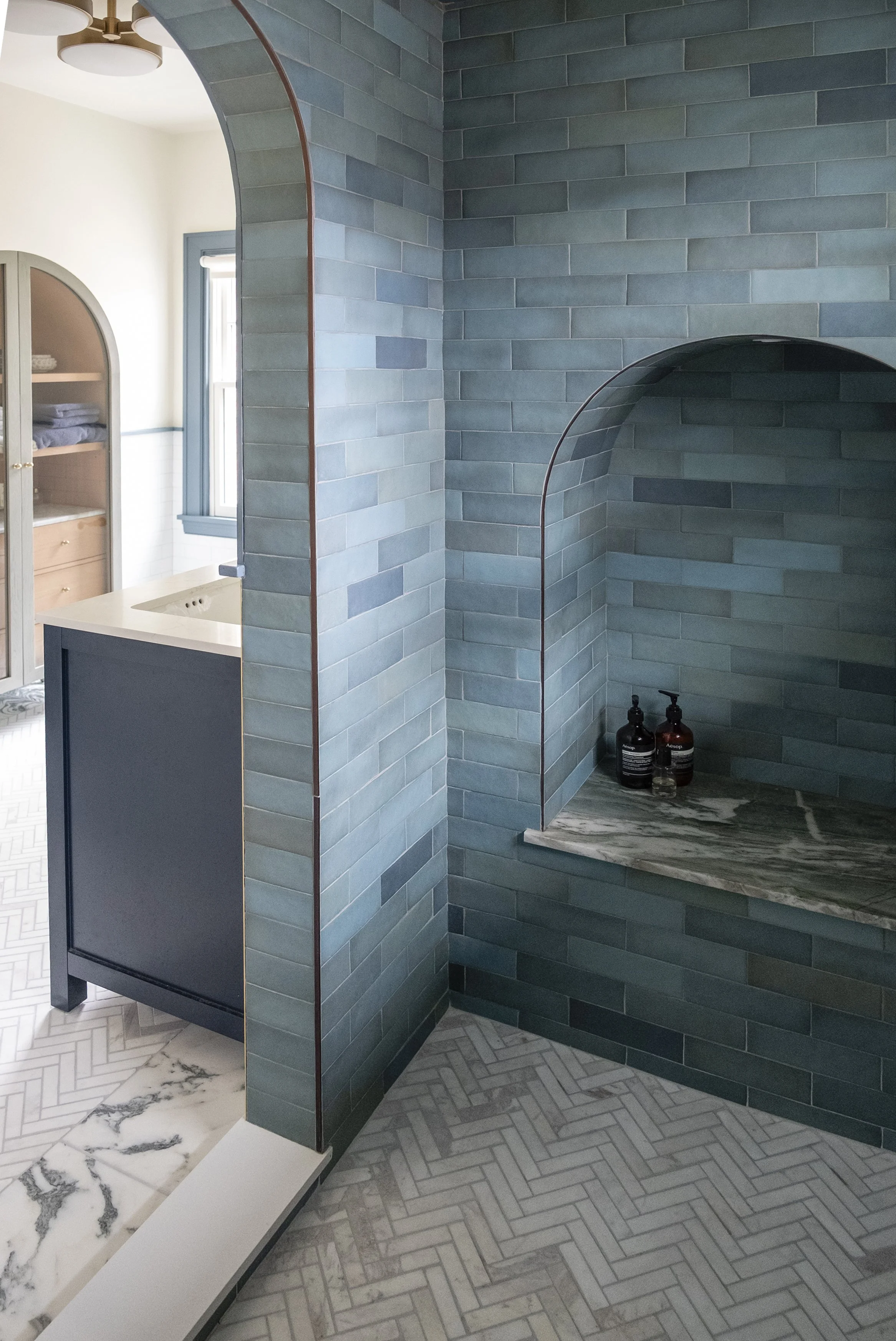
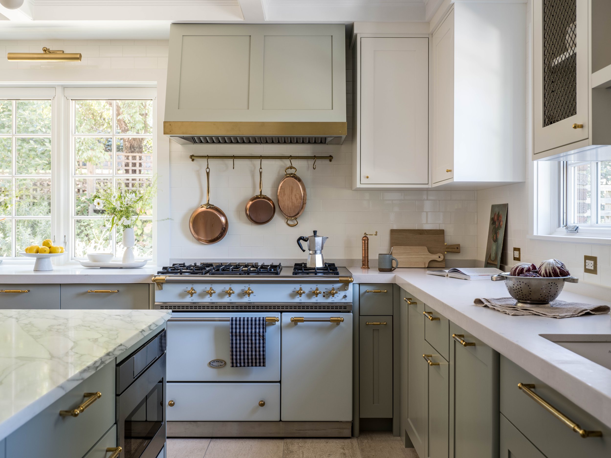
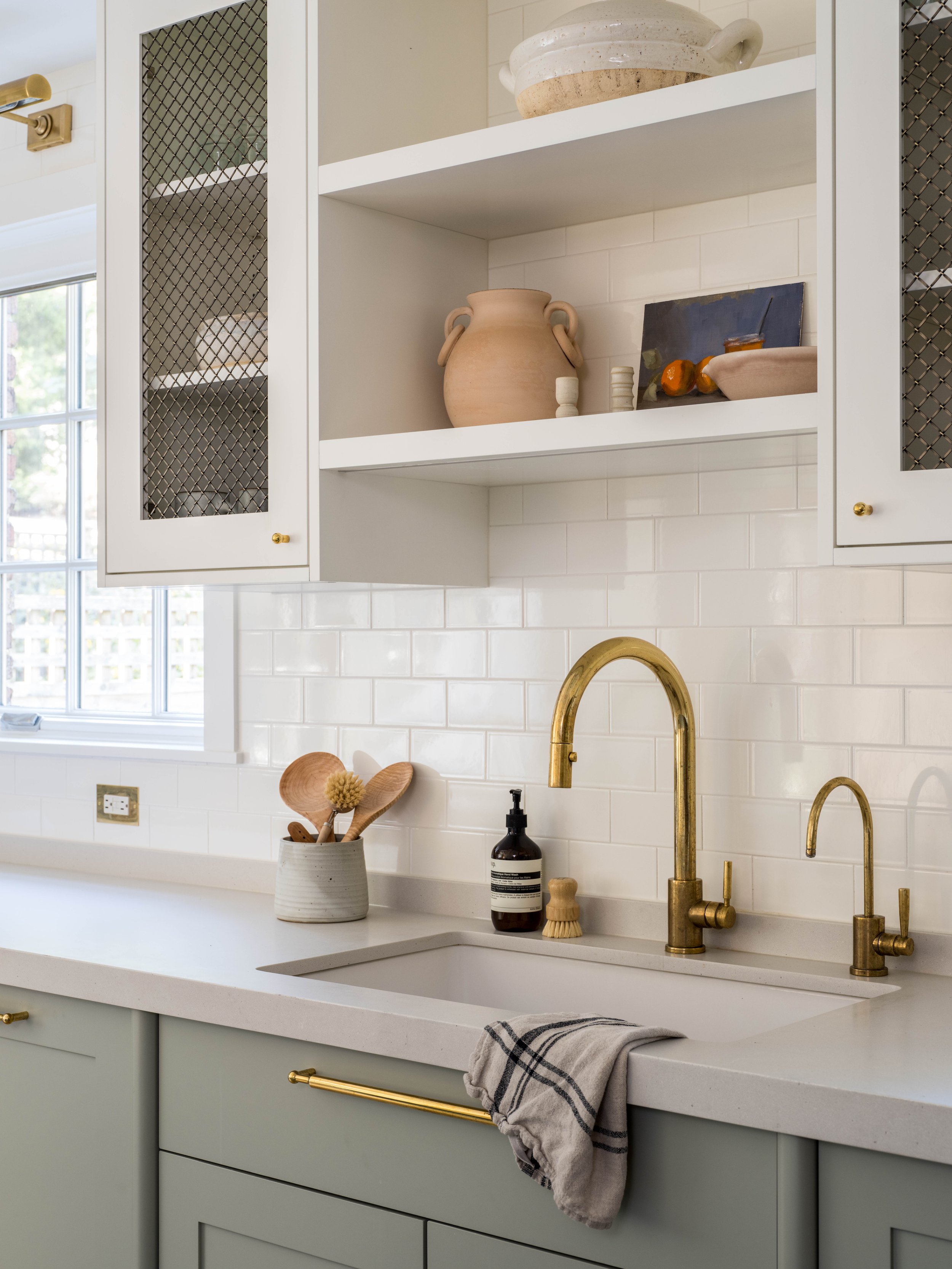
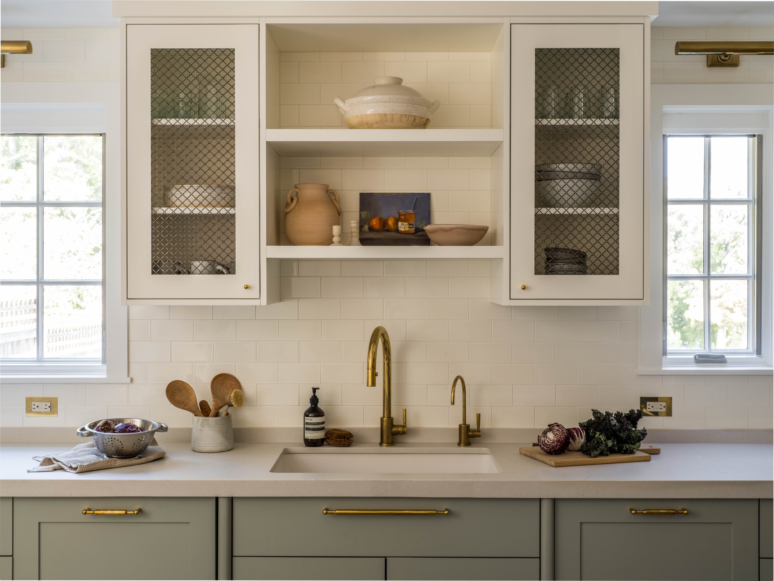
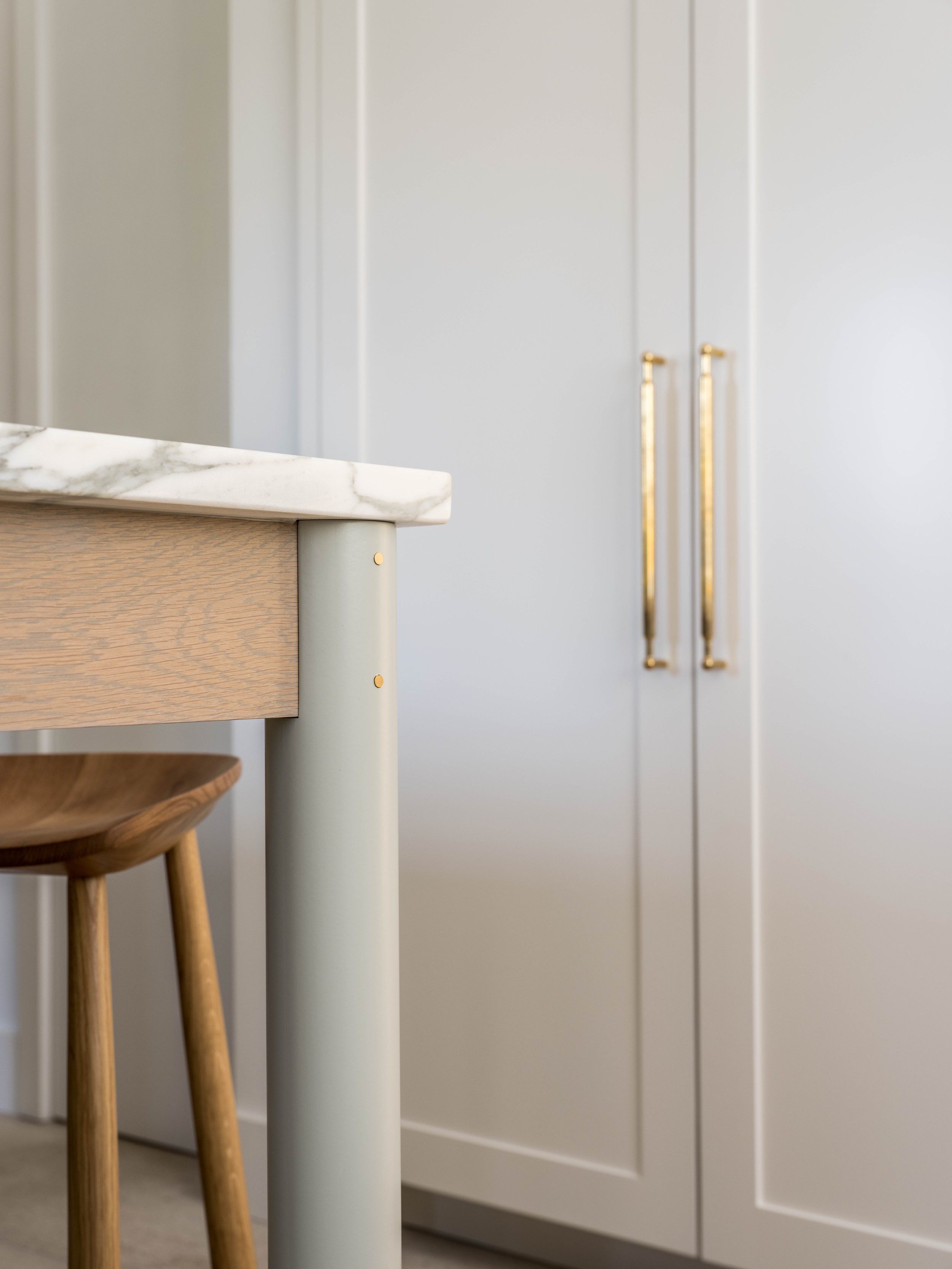
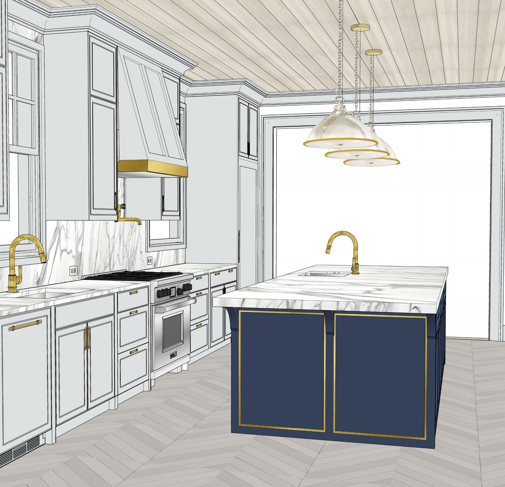
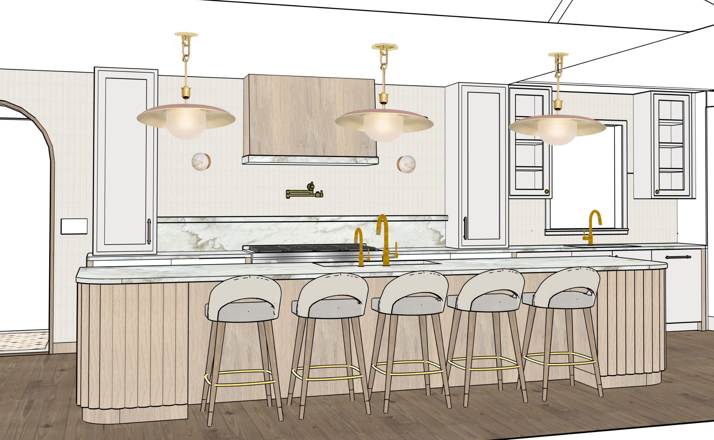
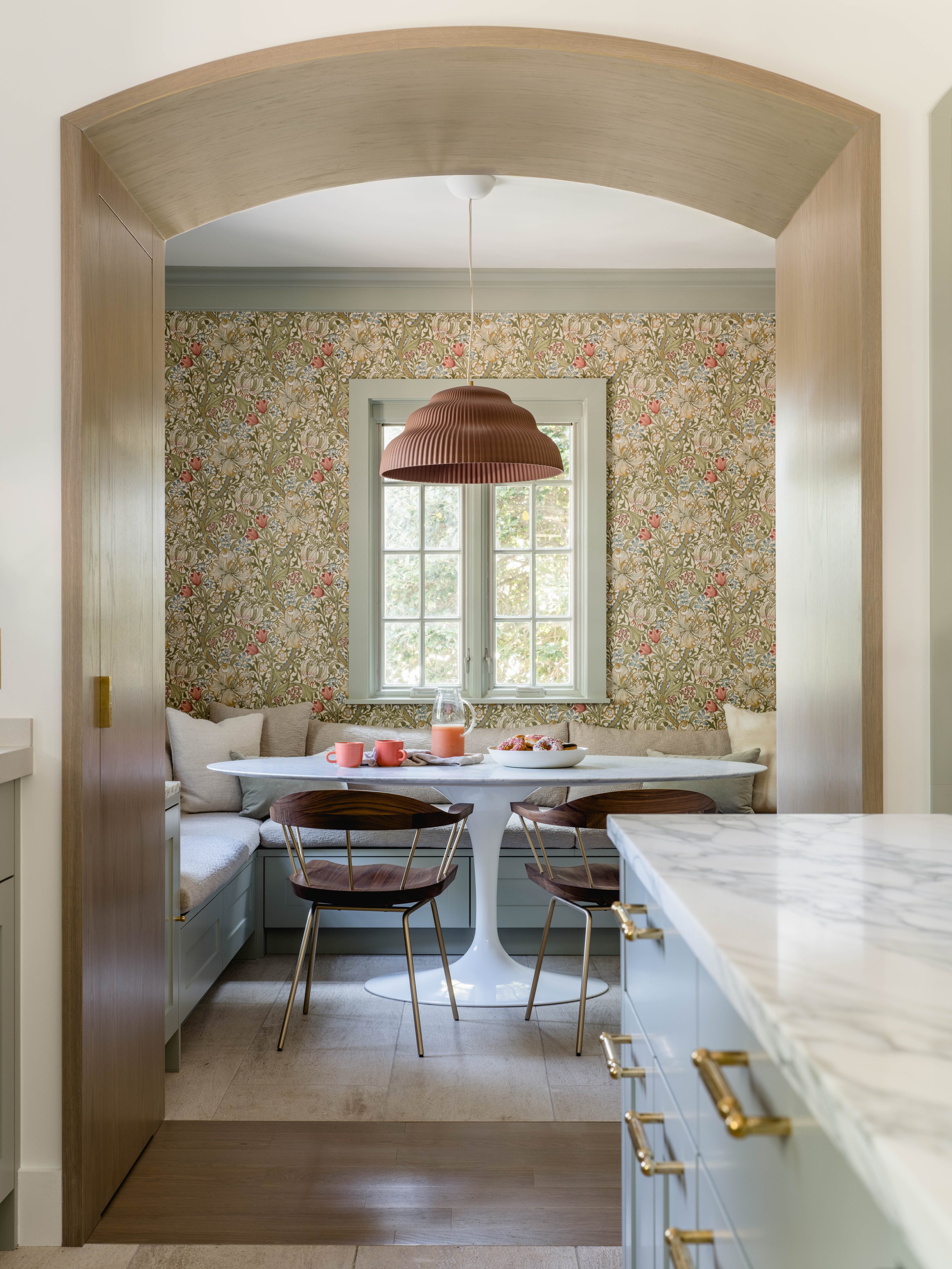
The house has a more traditional style but we wanted the kitchen to feel bright and inviting and to meld with the client’s more modern taste in furniture and art. One of the first pieces selected was the traditional La Canche French Range which is a real focal point of the space. The client was also inspired by the natural materials and well thought out details of traditional English kitchens but wanted an end result that was a little more contemporary in style. I set out to design custom cabinetry that would maximize the space and incorporate unique details for a one of a kind space. The island has half round legs that are joined by their cross supports with a brass cap detail. I found the round wood components from a lumber supply catalogue, wanting to create a unique detail without having to make a really extravagant custom part.
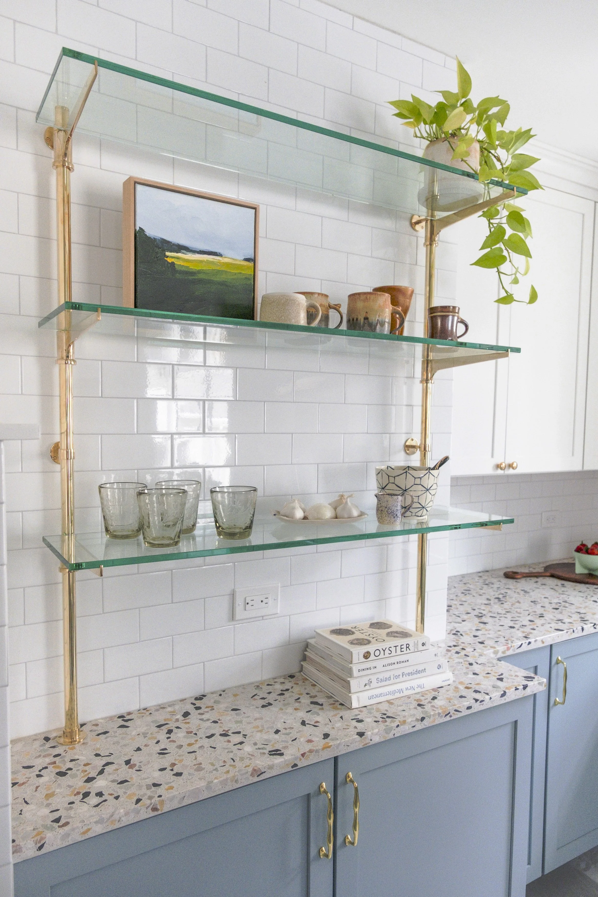
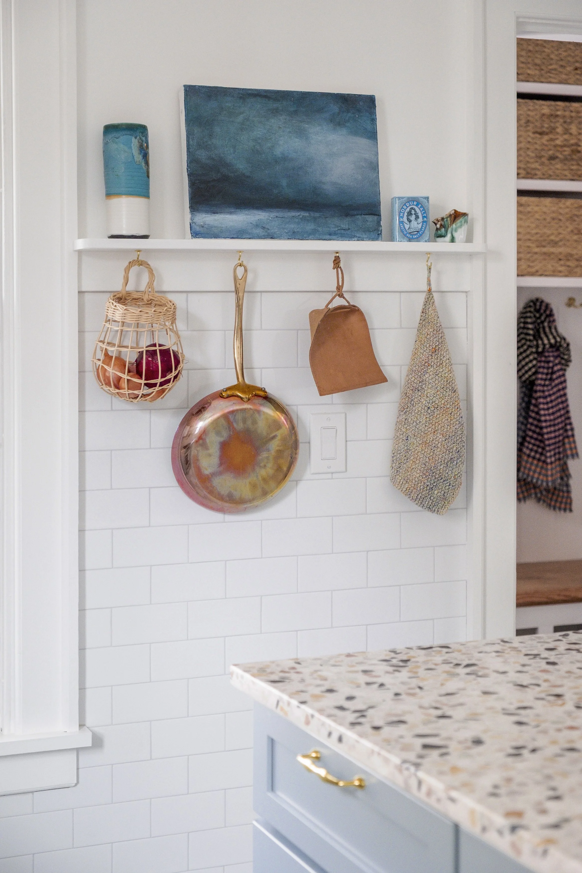
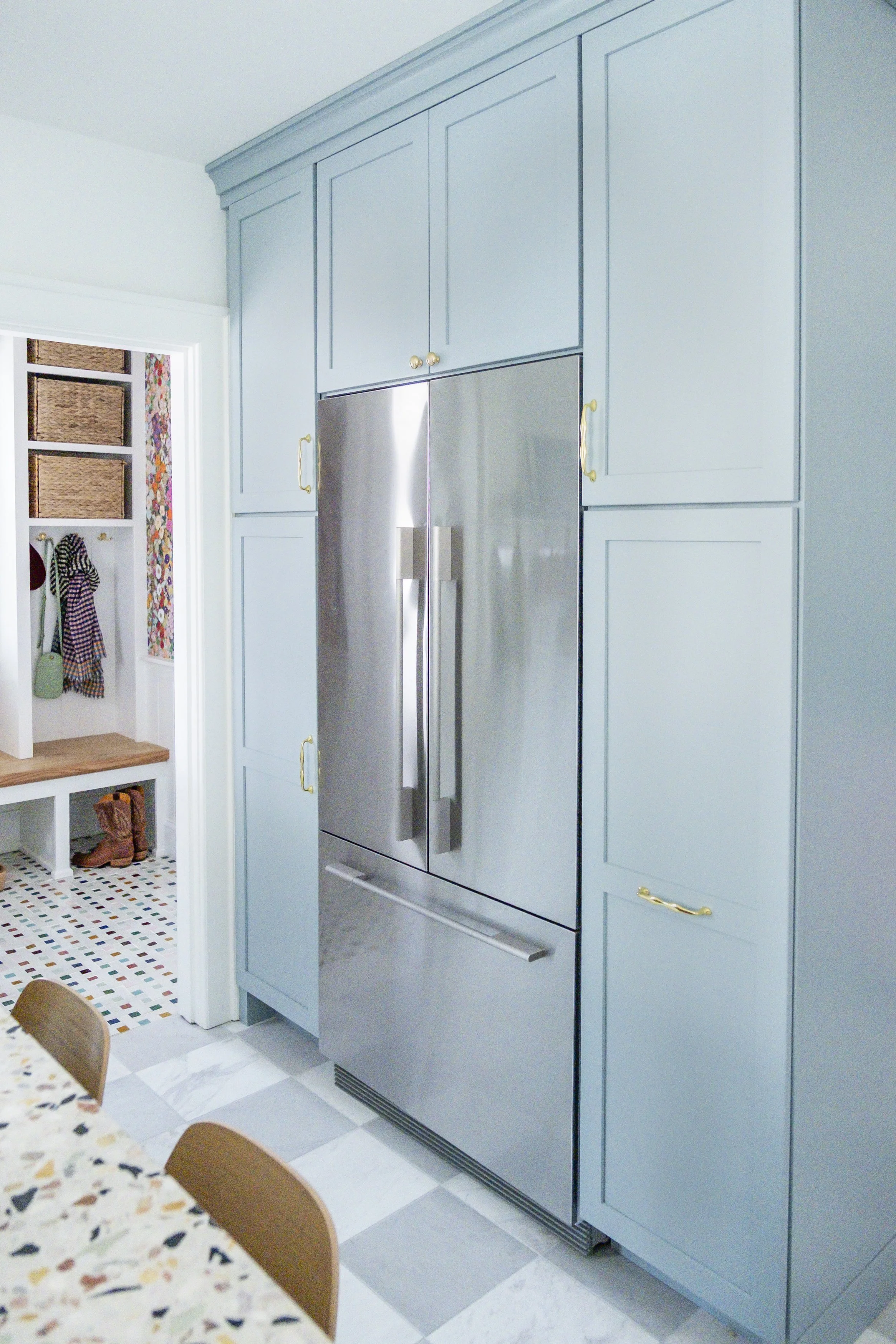
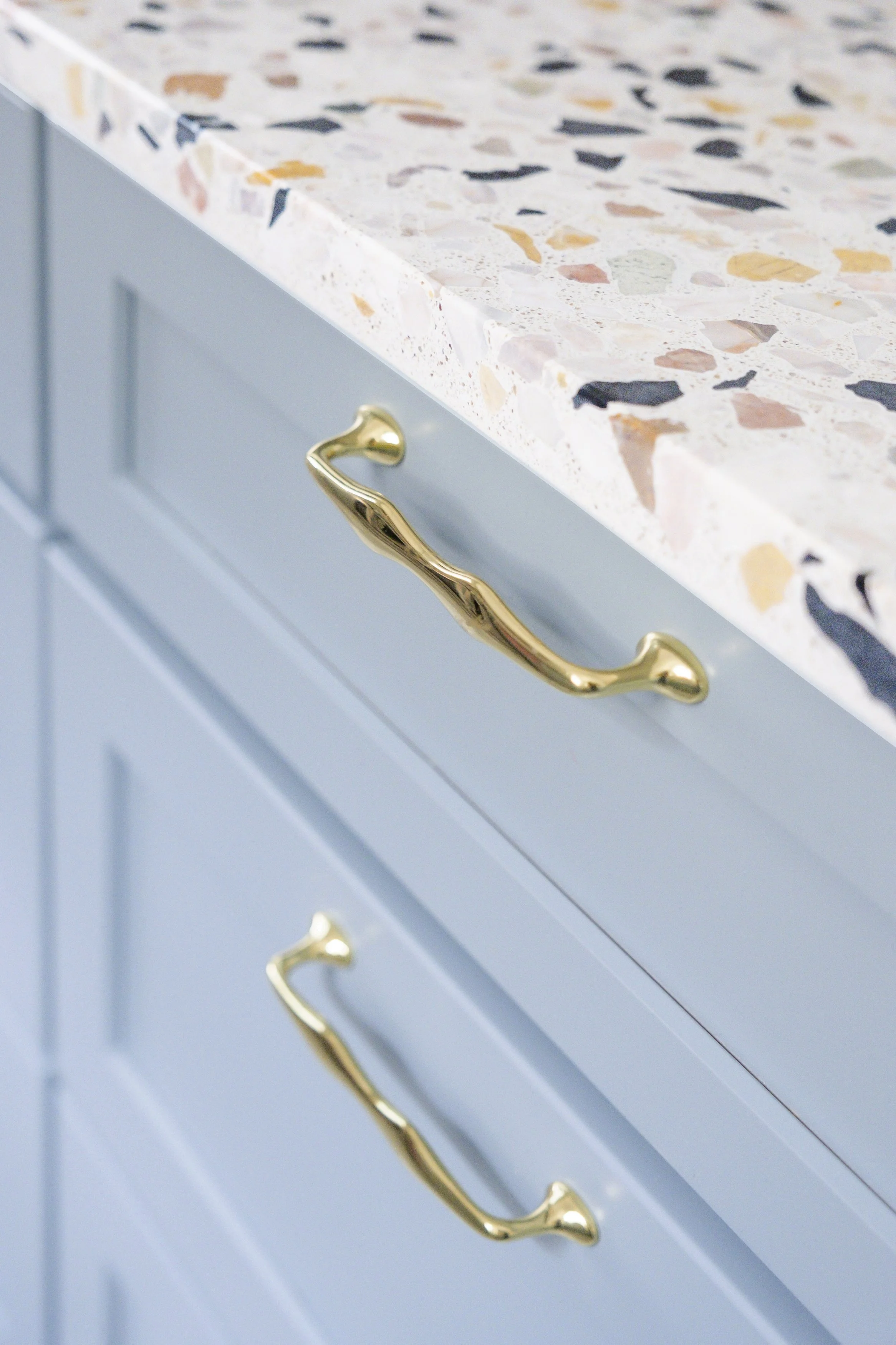
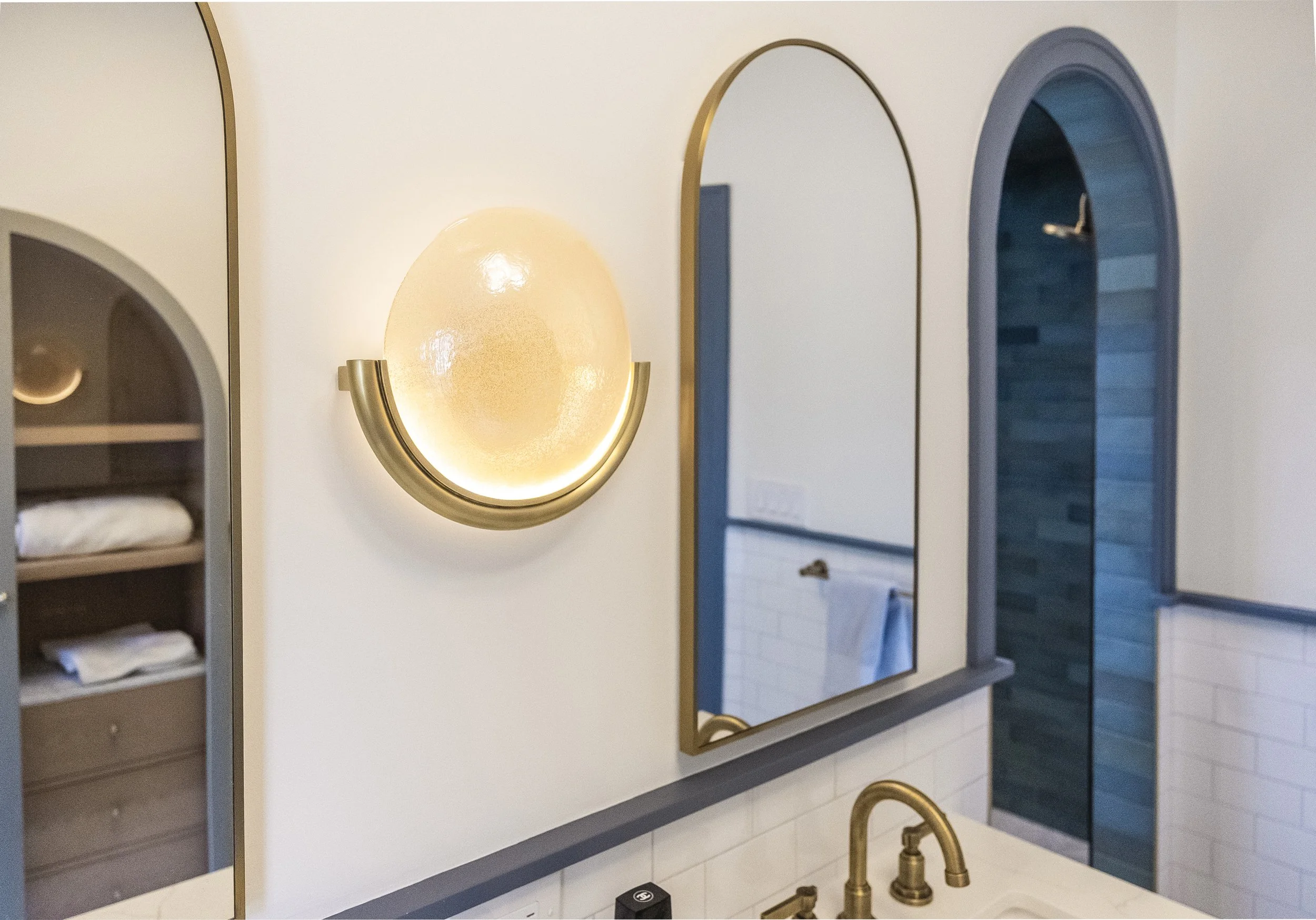
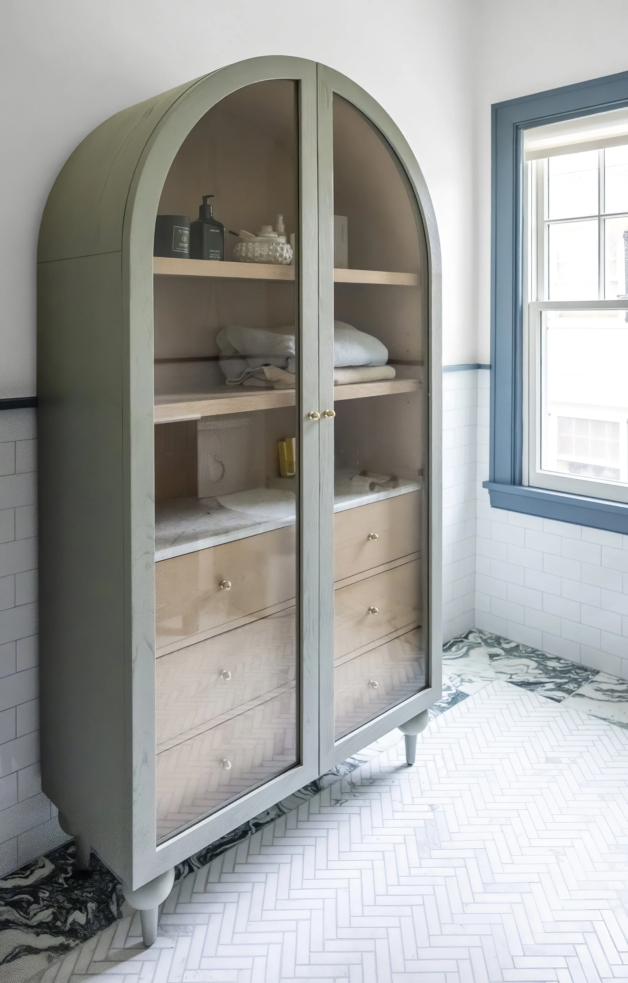
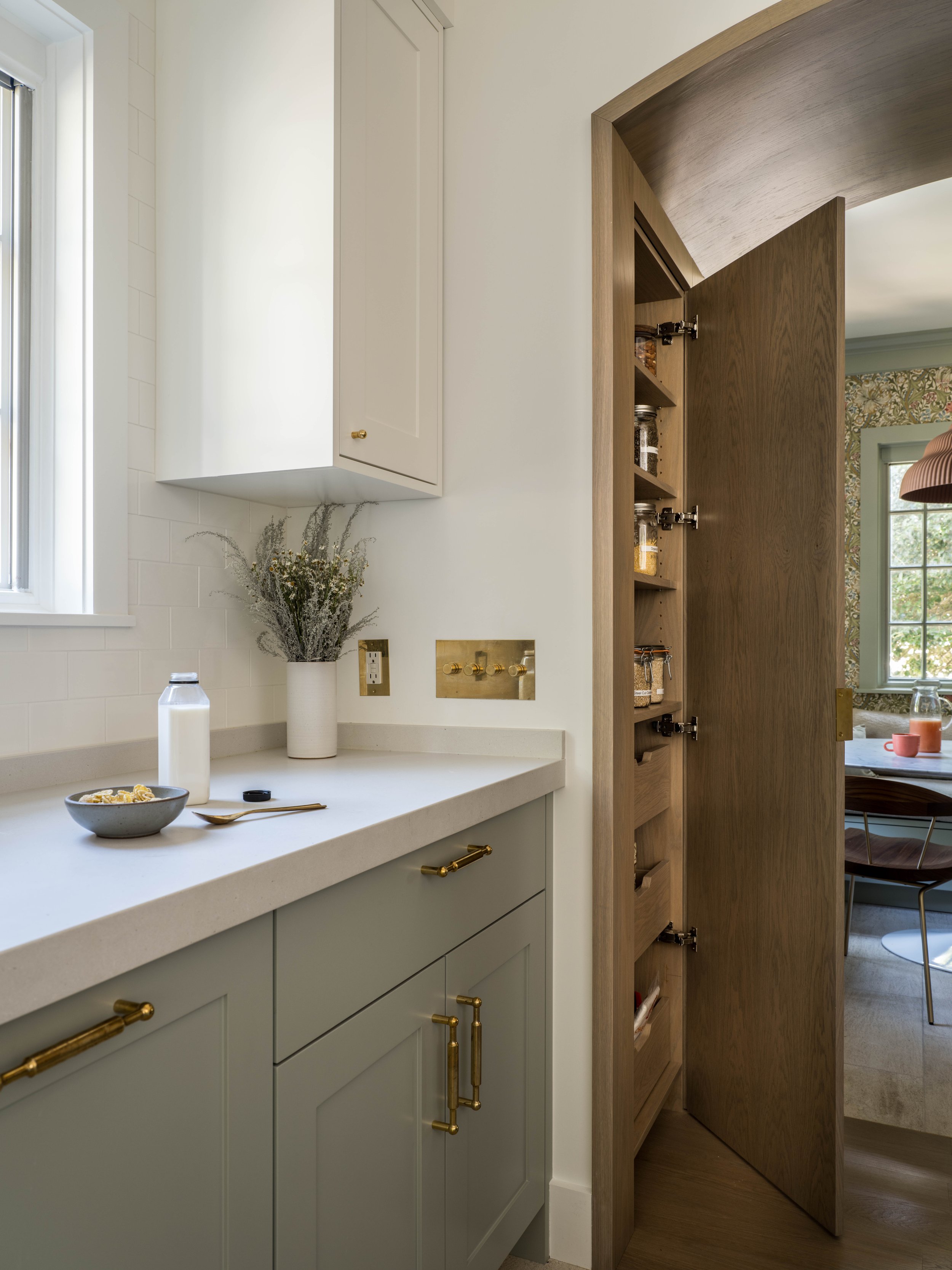
There was an existing arched opening to the breakfast room and I decided to keep the shape but deepen it to create a hidden pantry cabinet on the way to the breakfast room. The new Oak arch creates a clean and modern transition between the rooms, in contrast to the highly decorative Tudor style doors to the Dining room. We repeated the arch shape on the paneled refrigerator doors which make them look even less like appliances! From the outset of this project I had planned to work with cabinet maker, Erik Gonzalez. We communicate really well through the design process and I love collaborating with him to figure out how to fabricate design details and make a kitchen really function at a high level. The cabinet hardware is by O&G Studio, the details of their handle designs are so unique and they feel substantial without being visually overwhelming.
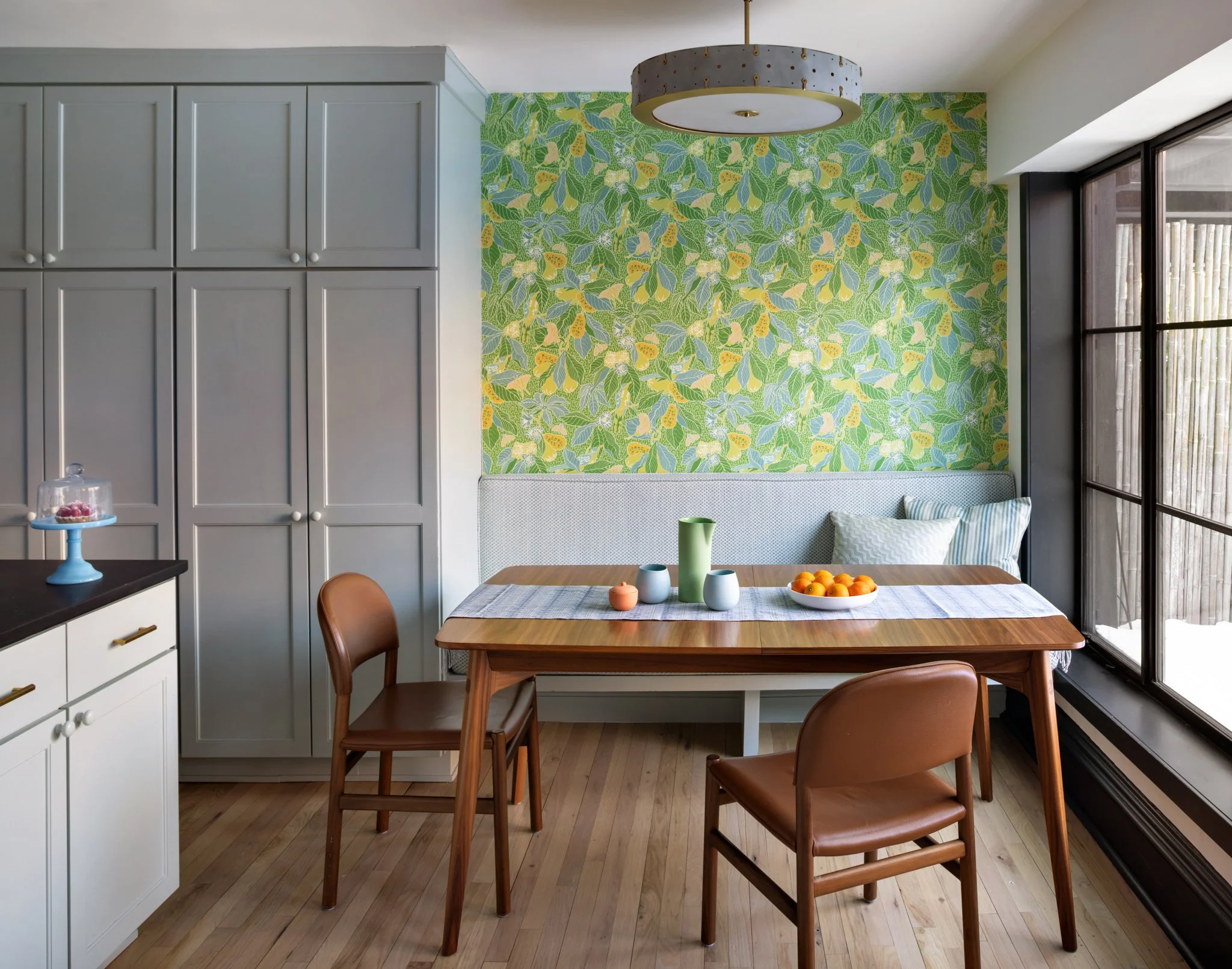
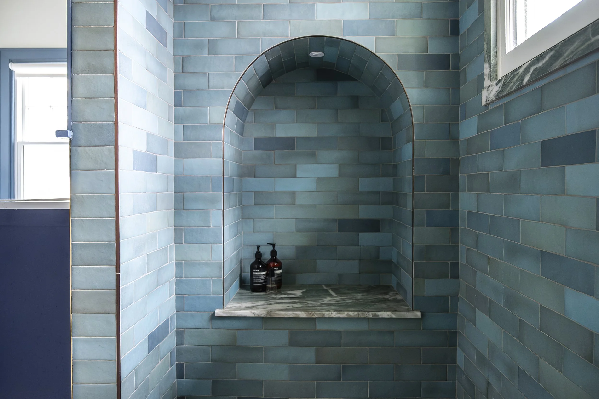
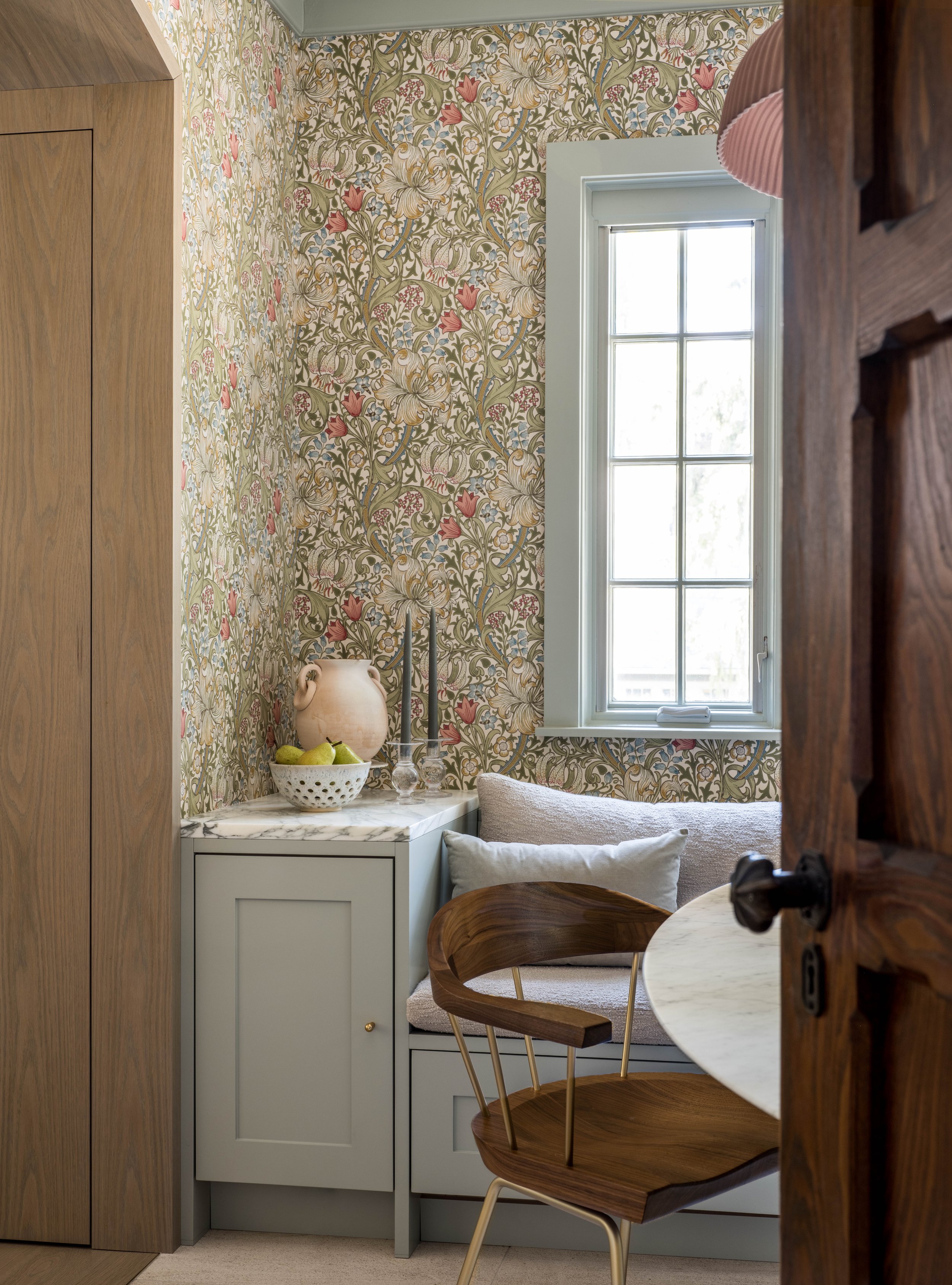
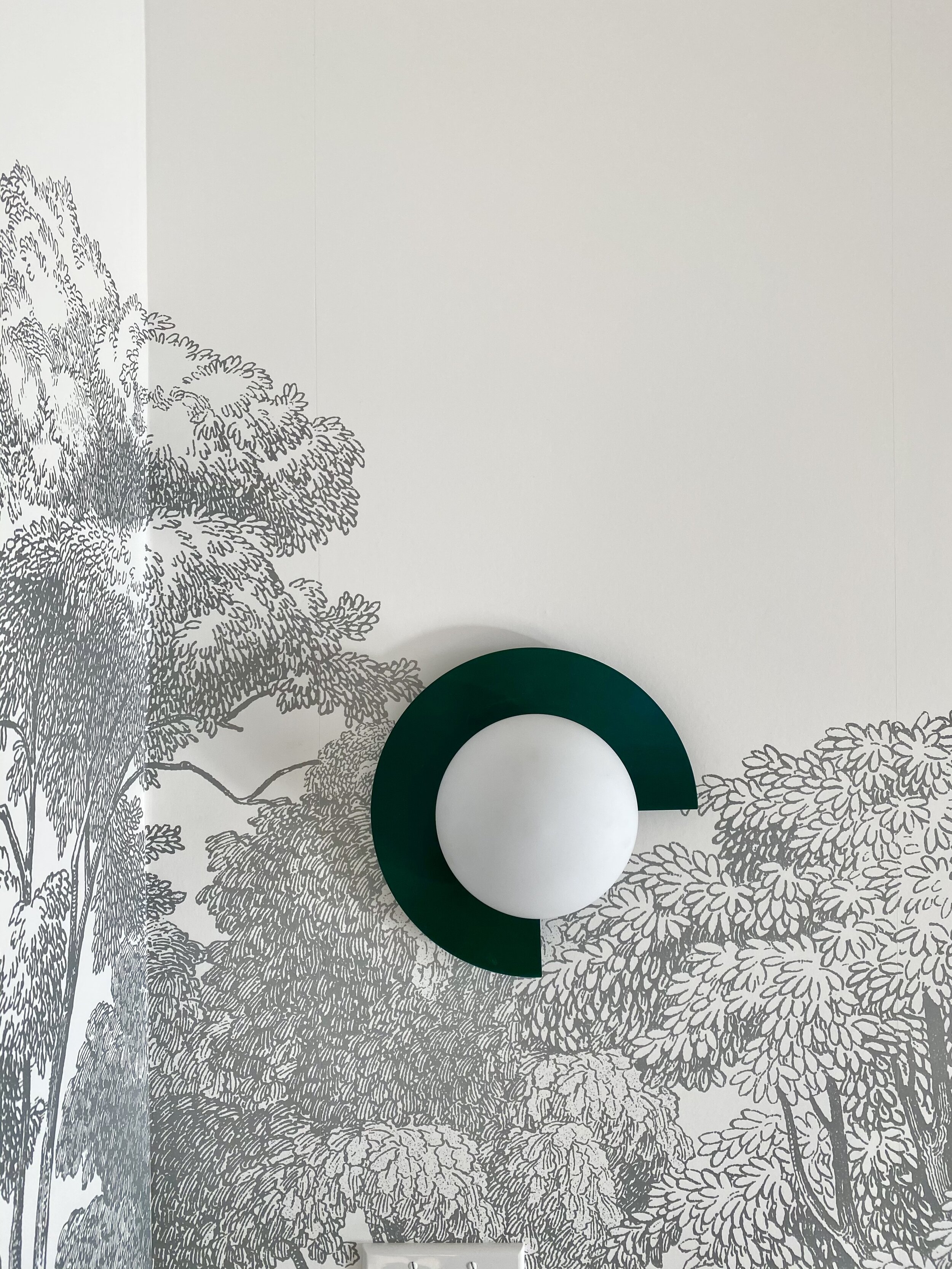
A lot of the material palette pulls from the Morris & Co wallpaper that we selected early on for the breakfast room. I love the combination of blues, greens, reds, and pinks in this print. The ceramic light by Schneid sits over the breakfast table and is the perfect shade of red and I love the ribbed texture that feels modern with a little nod to more traditional lighting. Limestone floor tile to replace the old dark wood floors added a great amount of light to the space.
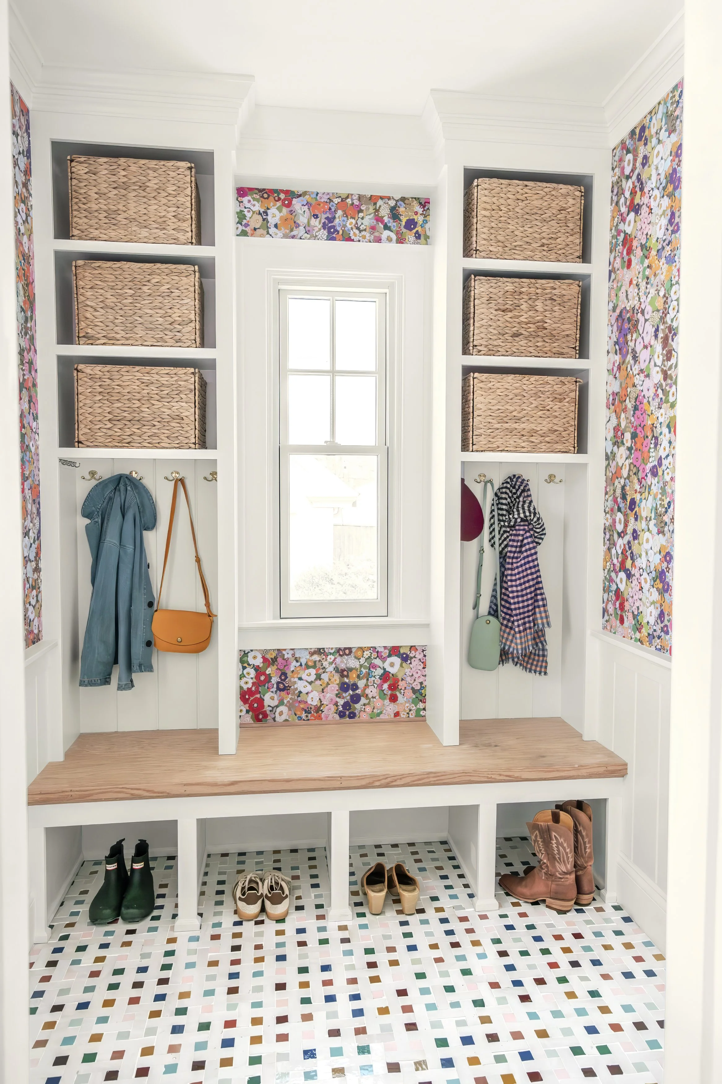
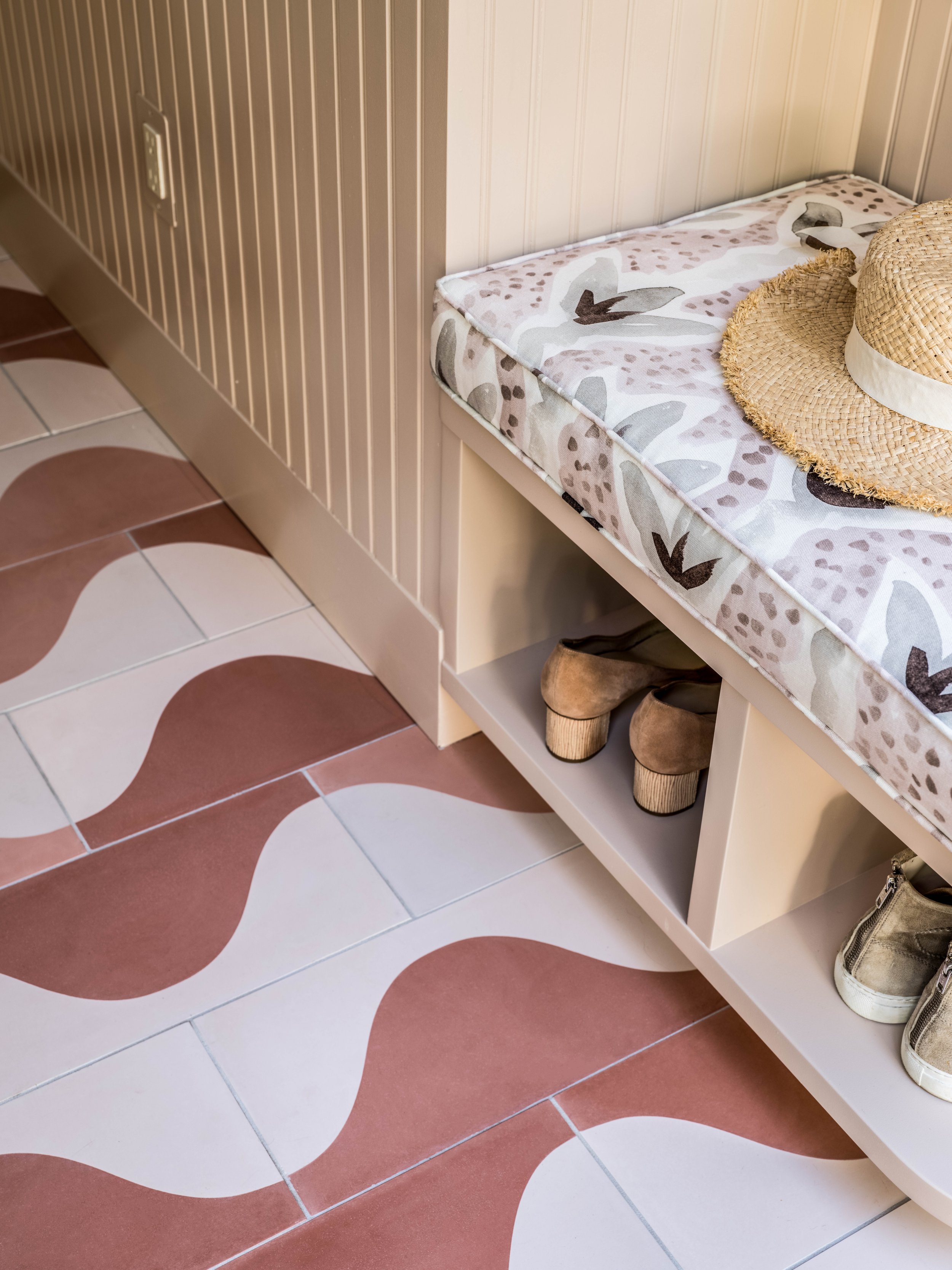
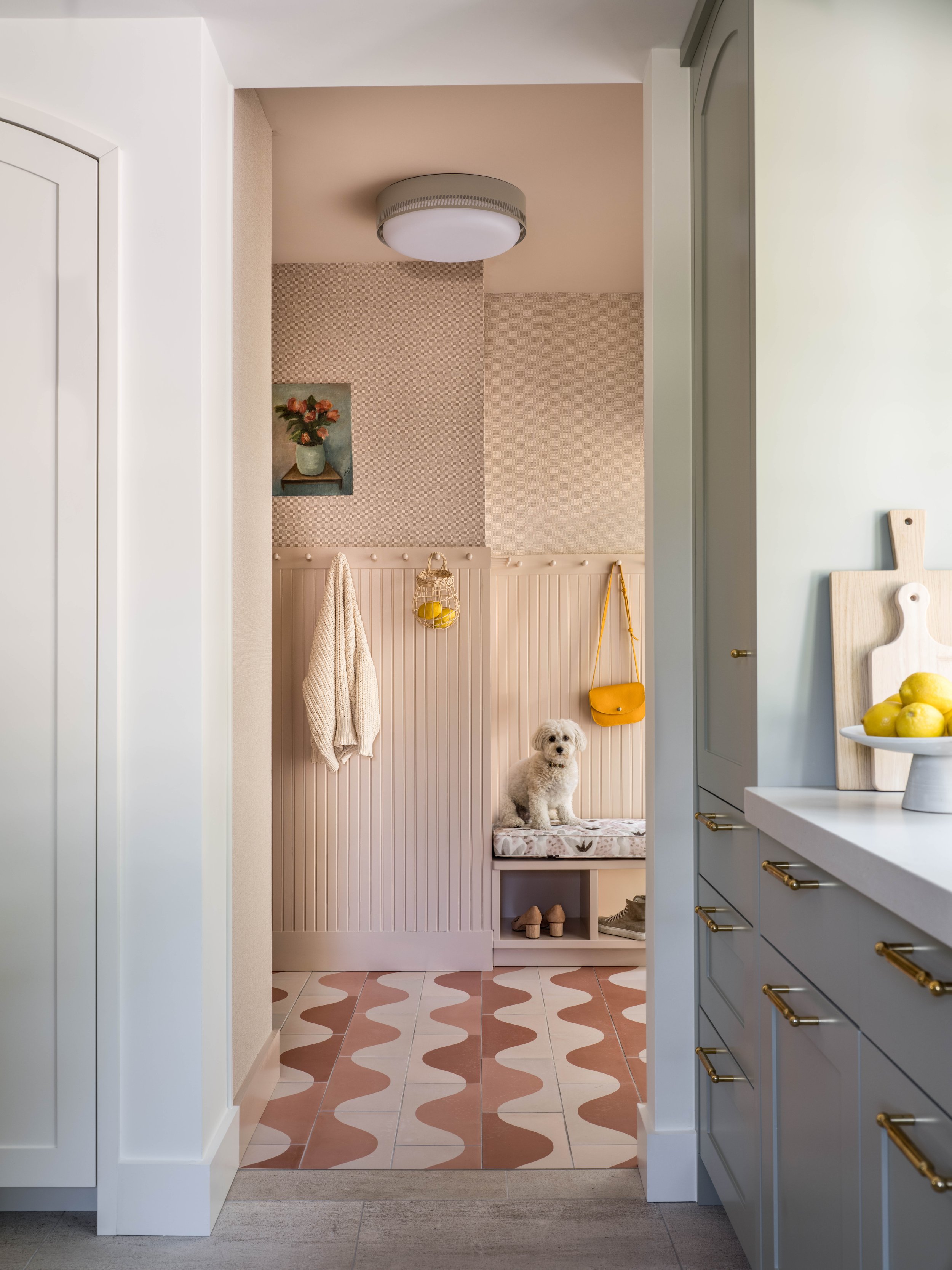
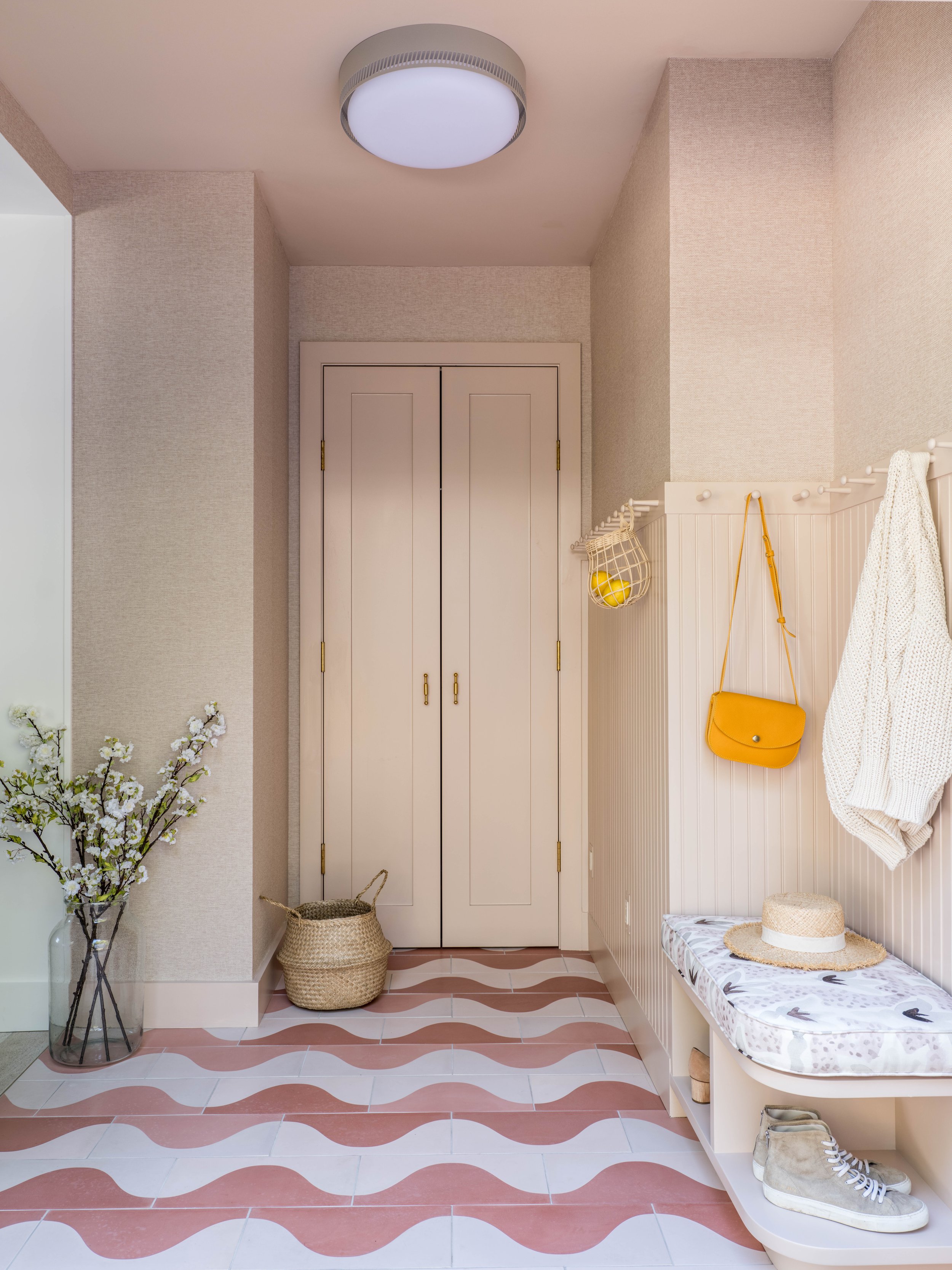
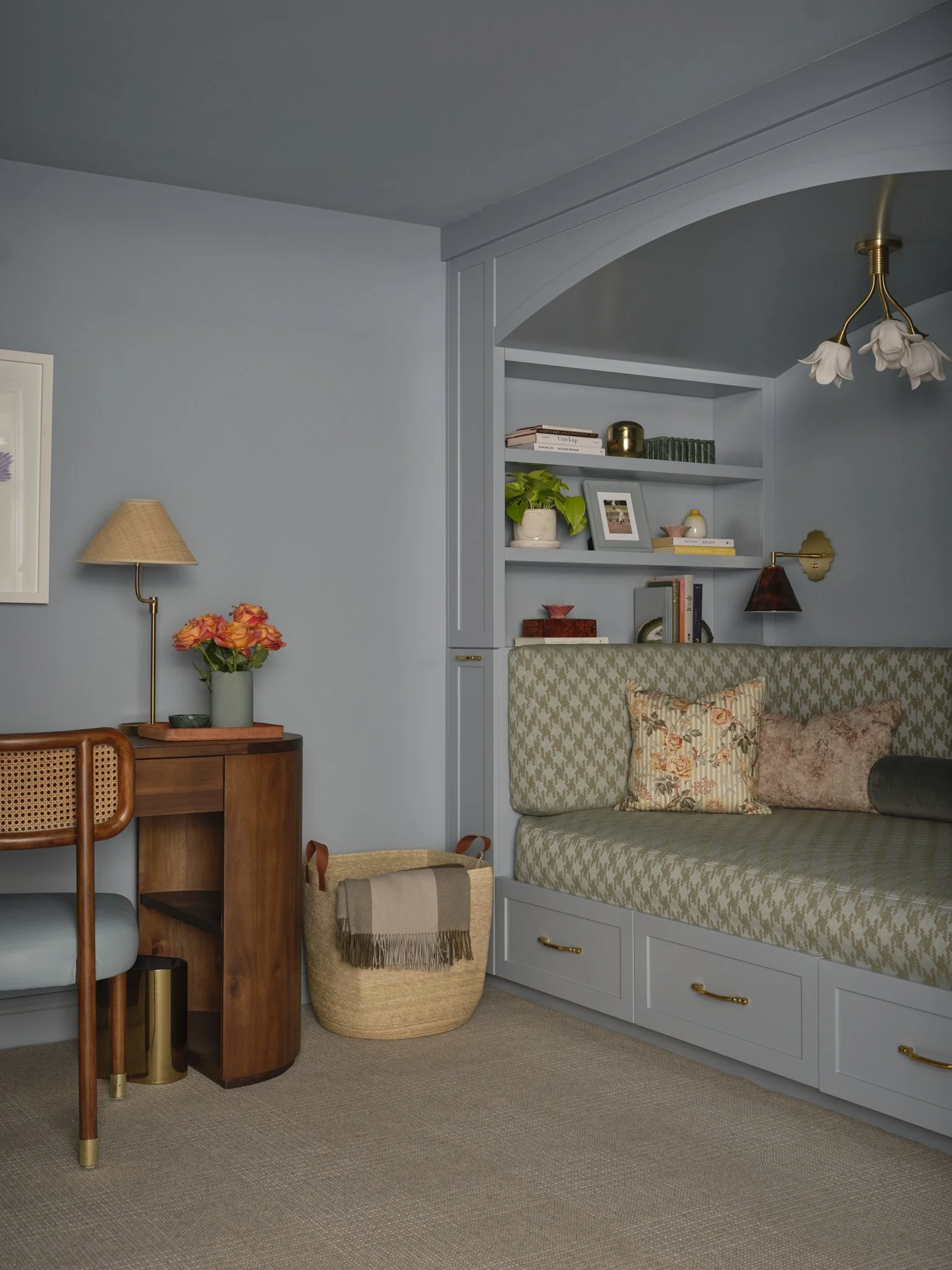
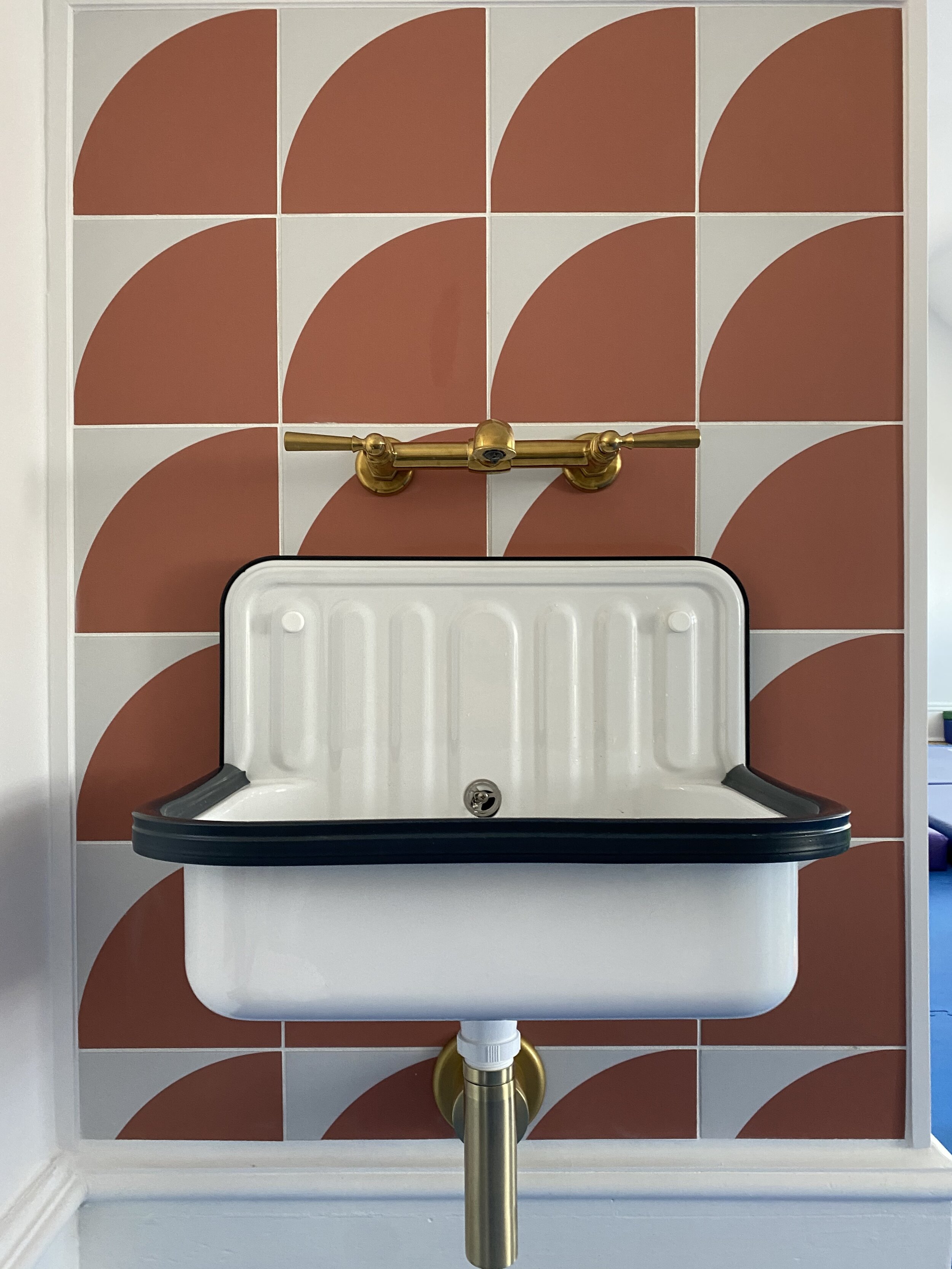
The little mud room is painted in Farrow and Ball’s “Setting plaster” with a playful Aimee Wilder design tile on the floor. we added a floral print Rebecca Atwood fabric to the seat cushion.
Finished photos by Erin Litte